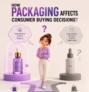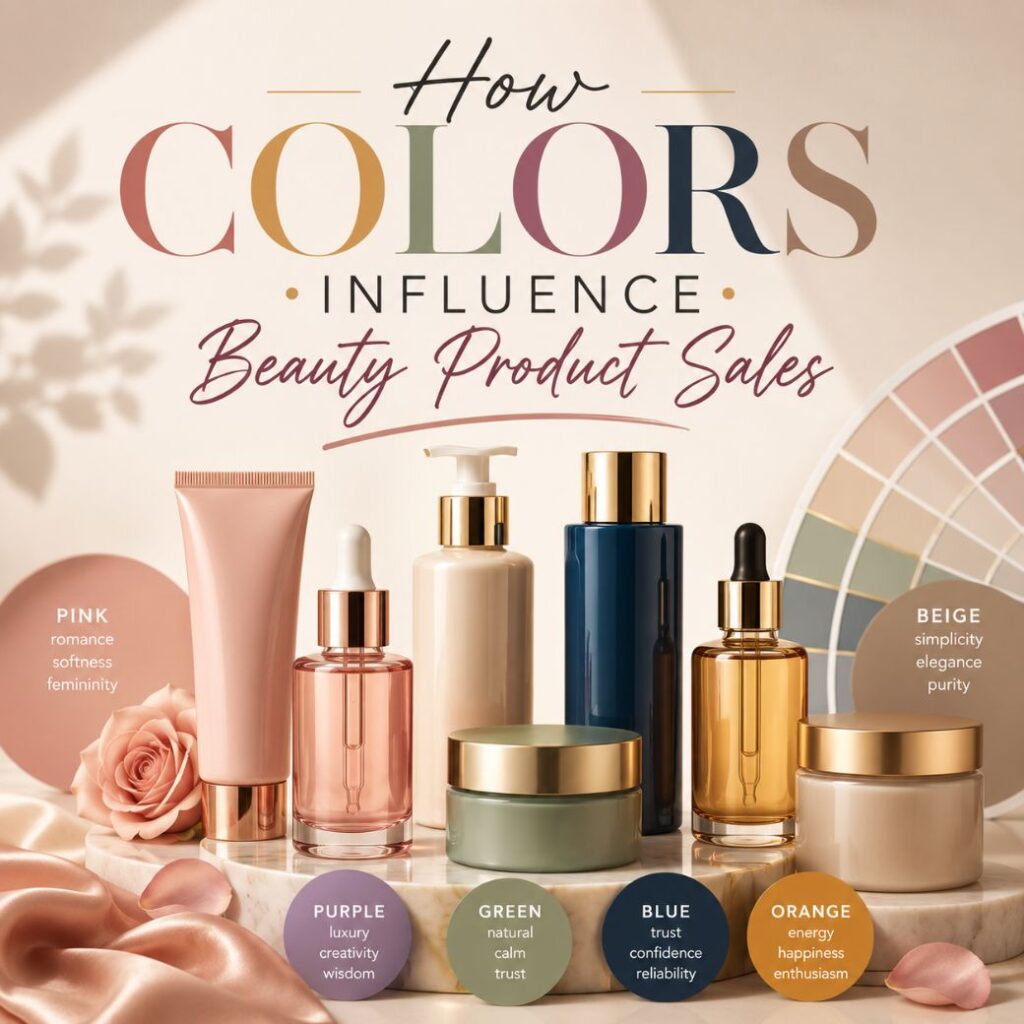
Your packaging speaks before you do.
Before a customer reads your brand name, checks your ingredients, or even picks up your product, they’ve already formed an opinion. And nine times out of ten, that opinion was shaped entirely by colour.
Colour is not a design afterthought. In the beauty industry, it is one of the most powerful and immediate sales tools you have — built right into your bottle, your jar, your tube, your box. Get it right, and your product practically sells itself off the shelf. Get it wrong, and even the best formula in the world can go unnoticed.
Think about the last time you walked into a beauty store. Chances are, a colour pulled you in before a single claim caught your eye. That’s not a coincidence; that’s consumer psychology at work. The brands dominating shelves today aren’t just selling great formulas; they’re selling a feeling, and colour is what delivers that feeling first.
Here’s what every beauty founder needs to understand about colour and how to use it strategically.
The Science Is Simple: Color Triggers Emotion Before Logic
The brain processes colour in milliseconds, long before language, reasoning, or rational thought kicks in. When a shopper sees your product, they feel something instantly. Calm. Excited. Trusting. Luxurious. That split-second emotional reaction is what drives them to reach for it or walk past it.
This is why leading beauty brands invest heavily in colour strategy. It’s not about looking pretty. It’s about triggering the right feeling in the right customer at exactly the right moment.
What the Most Powerful Colors in Beauty Are Saying
Black — Instant Luxury
Black packaging communicates prestige, confidence, and high performance without saying a word. It’s the dominant colour in premium skincare, luxury fragrance, and professional makeup lines and for good reason. A sleek black glass bottle or a matte black jar instantly positions a product at the top end of the market. Pair it with a gold foil logo or a soft-touch surface finish, and the perceived value goes up even further.
White — Trust and Transparency
White is the colour of clean beauty. It signals purity, clinical credibility, and an honest “nothing to hide” approach, exactly what today’s ingredient-conscious consumer is looking for. It’s the go-to choice for science-backed skincare, dermatologist-recommended products, and minimalist DTC brands. As a bonus, white packaging photographs beautifully, making it a social media favourite for brands building their presence on Instagram and TikTok.
Pink — Self-Care and Shelf Appeal
Pink is warm, inviting, and deeply tied to the pleasure of beauty rituals. It performs exceptionally well in lip care, blush, body care, and bath collections, and it dominates in gifting. A blush-toned box or a rose-tinted dropper bottle tends to find its way into more shopping carts, more gift bags, and more unboxing videos than almost any other colour. It’s also one of the top performers in social commerce – pink products simply stop the scroll.
Green — The Color of Conscious Beauty
Green has become the universal signal for clean, natural, and sustainable. As more consumers shift toward eco-conscious choices, green packaging immediately communicates that a brand shares their values. It works especially well when the packaging material backs up the message – recycled bottles, sustainably sourced cartons, and plant-derived caps. When the colour and the material tell the same story, the brand’s credibility becomes undeniable.
Gold and Metallics — For When It Needs to Feel Special
Gold, rose gold, and chrome finishes communicate one thing above all else: this is worth it. Whether it’s a foil-stamped label on a serum, a metallic closure on a perfume bottle, or a gold-accented rigid gift box, metallics elevate a product’s perceived value instantly. They’re especially effective in holiday collections, limited editions, and gifting ranges – where the packaging itself needs to feel like part of the gift.
Finish Matters as Much as Color
The same colour can tell completely different brand stories depending on the surface it lives on.
A matte finish feels modern, editorial, and premium, perfect for luxury skincare and clean beauty. A glossy finish feels vibrant and youthful, ideal for colour cosmetics and playful beauty brands. A frosted surface suggests delicacy and purity, which works beautifully for serums and wellness products. And a soft-touch laminated surface, velvety to the touch, sends an instant tactile signal of quality the moment a customer picks the product up.
Colour and finish work together. One without the other tells only half the story.
Consistency Is What Builds Recognition
Choosing the right colour is step one. But the brands that become truly memorable are the ones that own their colour – consistently, across every single touchpoint.
Your primary packaging, your outer box, your shipping materials, your website, and your social content, all of it should speak the same colour language. When every element aligns, colour becomes more than a design choice. It becomes your brand’s most recognisable asset. Customers start to recognise your product from colour alone, before they see your logo, before they read your name.
That’s called colour equity, and it’s one of the most valuable things a beauty brand can build.
For Founders: Three Questions to Ask Before You Commit to a Color
1. What do I want my customer to feel? Before you look at a single swatch, define the emotional experience your brand promises. Your colour should deliver that feeling before a word is read.
2. What are my competitors doing? Map your category. Then decide – do you want to fit in or stand out? Both are valid strategies. Neither should be accidental.
3. Does this colour work across all my formats? A colour that looks stunning on a glass bottle needs to work just as well on a folding carton, a product label, a shipping box, and a website banner. Think in systems, not individual pieces.
Color Is Your First Impression – Make It Count
In a beauty market this crowded, your packaging colour is often the first and sometimes only chance you get to stop someone in their tracks. The brands that treat colour as a strategic decision, not a stylistic one, are the ones that build lasting recognition, command higher prices, and earn the kind of loyalty that keeps customers coming back long after the first purchase.
Choose your colour with intention. Apply it with consistency. And let it do the selling for you.
Looking for packaging that brings your brand’s colour story to life? At CMKart Global Private Limited, we help beauty founders create custom packaging from concept to production that’s built to stand out. Let’s talk.